When it comes to colour, a lot of us can get into a rut. We choose the same stones over and over because they’re our favourites or we’ve gotten so used to those colours, we don’t think of anything else. If you want to try something new, but don’t know where to start, try looking at Pantone’s colours for the season.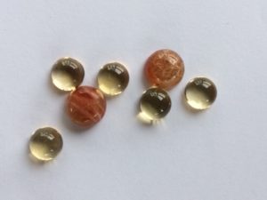
The Pantone Colour Institute was started in New York City in the 1950s. They created a set of standardized colours so that different manufacturers of paint, fabric, ink and plastics could accurately match colours. This is called the Pantone Matching System, or PMS for short. ( No, this PMS will not make you cranky and bloated!) Starting in 2000, Pantone started announcing the “Colour of the Year” as well as colour reports two times a year, for spring and fall. These colours are chosen by a group of industry representatives who meet twice a year in a secret European location. (Sounds rough!) These colours are used in fashion, decor and various other industries.
What does this have to do with me?, you ask. What I like to do is match the colour swatches to different stones. For example, one of the colours for spring is Flame, which is a reddish orange. I matched that to sunstone and light carnelian, which are not stones I normally use. Try pairing these with lapis blue, which is another colour for spring for a stunning piece of jewelry. These are the colours for spring and the stones that I have matched them to:
Primrose yellow- citrine, light amber:
Flame- sunstone, light carnelian:
Pale dogwood- light rose quartz:
Pink yarrow-pink sapphire: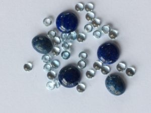
Hazelnut-Botswana agate:
Niagara-denim lapis:
Island paradise- blue topaz, aquamarine:
Kale-dark green jade, bloodstone:
Greenery-peridot (Colour of the Year 2017!):
Lapis blue- self-explanatory: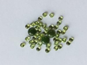
Don’t be afraid to try what may seem to be unlikely colour combinations. You may be surprised to find some new favourites, both single colours and combinations! Working with a limited colour palette forces us to be more creative because we have to move outside our comfort zone and go in directions that we have never considered before. Above all, remember that the world is in colour, so look around you for inspiration. It’s everywhere!