Hard to believe, but summer’s almost over. I know, I can hear you out there, but don’t blame me. Time marches on, and with it comes Pantone’s colours for fall. Whatever you may think about the coming season, one of the things I really like is the inspiration of a new palette of colours that I may never have thought to put together. It’s easy to get in a rut because we tend to choose our favourite stones over and over. A colour palette like Pantone’s can help you break out of your rut and try something different. Who knows, maybe you’ll find a new favourite stone!
Panetone has two colour palettes this year; one for New York and one for London. I looked through both to get some ideas about what stones would correspond to the different colours and came up with the following:
New York:
Grenadine-carnelian
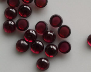
Tawny Port- dark garnet
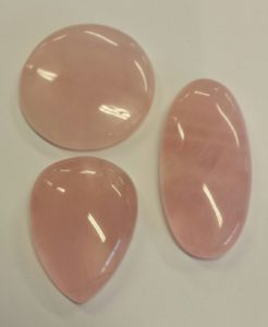
Ballet Slipper-rose quartz
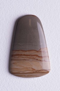
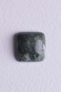
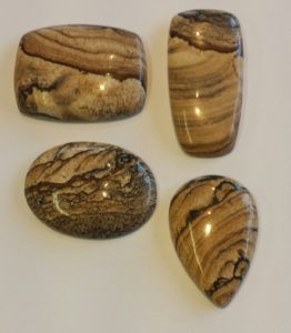
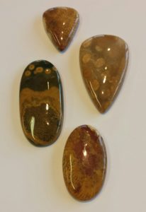
picture jasper-perfect combination of fall colours!
Butter Rum- picture jasper
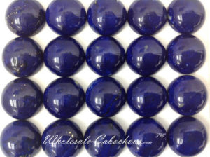
Navy Peony- lapis lazuli
Neutral Gray- picture jasper
seraphinite
Shaded Spruce- seraphinite
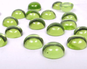
Golden Lime- peridot
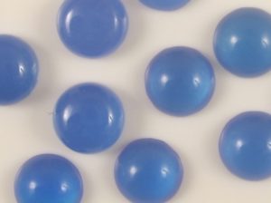
Marina- blue agate
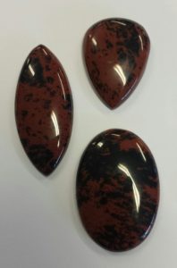
Autumn Maple- mahogany obsidian
London:
Flame Scarlet- light garnet
Primrose pink- rose quartz
Toast- desert jasper
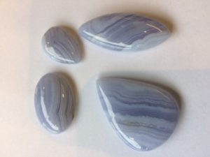
Blue Bell- blue lace agate
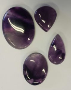
Royal Lilac- deep amethyst
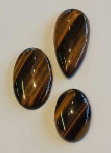
Otter- tiger eye
Navy Peony- lapis lazuli
copper
Copper Tan- copper
Lemon Curry- fossilized coral
Golden Olive- peridot
All of these beautiful stones are available in the studio right now, which gives you an opportunity to try different colours and shapes together. I’m inspired to put lapis and copper together for the fall. Cominations of complementary colours such as blue and orange (copper or carnelian) create bold jewelry. Amethyst and copper is another combination that appeals to me.You could also do a monochromatic palette with blue lace agate, blue agate and lapis for a more subdued look. Or you could choose a multi- coloured stone such as fossilized coral or picture jasper and accent it with a solid coloured stone. The picture jasper is a perfect combination of Butter Rum and Neutral Gray with a bit of Autumn Maple thrown in . Try it with an accent of carnelian to capture the feel of fall in a piece of jewelry. To create something really opulent looking, put garnet, amethyst and lapis together . This combination would look good in either gold or silver (I prefer silver) for a stunning piece to wear to all those holiday parties that you’ll be going to!
Whatever you do, don’t be afraid to try something new. Inspiration is all around, including the Pantone colour palette. See you in the studio!